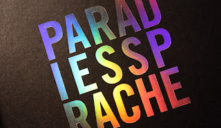
For the first crit we had to make 3 design boards and were put into groups for them, The 3 design boards were, concept, production and method of delivery. Most of the images that were on them are on my Design Context blog.
The Crit went really well as it we did not only get feedback from the tutors but we had a 3rd year BAGD student in the crit, and everyone else who was part of that group. We briefly went through each board and spoke about what and why we were planning to do. We got some really good feedback from the tutor about not leaving the production to the last minute, the 3rd year had also said to make sure that we tried all of the methods that we were talking about and to make use of the time we had for the whole brief.
The second crit was more about how we were coming along with it all as it was the first crit we had after the easter break. We had a substantial amount done as we had example of embossing on black cards and a few on white stock, as well as all the content that we was going to put into the publication. We got some decent feedback from other people in the crit about some of the finishing techniques were planning to go with but Amber really helped us out; as we had looked up spot varnishing online and did not find any places which would do small orders or within the time frame that we had, but she mentioned that it was doable in the university screenprint facilities.
The final crit was more just seeing how people's work had come to an end with it being a week away from the deadline, we had all of our page layouts done at this point, we just needed to get it printed and bounded.
Evaluation
Overall I was very pleased with how the publication turned out, as the finish of the cover and the print and stock quality was just what we had planned it to be. In terms of the actual design we had always had it in mind to keep it simple, which we thought would make it easier to read, therefore straight to the point. We did have some issues with the finishing though as there were some holes in the screen which meant that the text was not completely clear. When it came to the content we had decided to not put all of the things in the publication, as we had initially decided to put a lot of things which would be helpful and crucial but then we thought that one of the main things about freshers and being a fresher is finding things out for yourself and exploring things about Leeds, and the nightlife. So we cut back on some of the things which were a little too detailed and would have in a way been contradicting the actual brief as It is meant to be from the perspective of someone who has already been in that position and when we were freshers we certainly did not know everything but in fact had to go and find out the places by ourselves. Apart from the screen printing I would not have done anything differently, maybe printed on a slightly thinner stock as it was quite expensive.


