Tuesday 30 December 2014

Survey Questionnaire

I had sent out a survey questionnaire which was going to be used in my dissertation and practical and was aimed at collecting both qualitative and quantitate data.


Monday 29 December 2014

Stella Artois & Packaging Market Research

Considering that I was now going to be rebranding a new drink for Stella Artois and was indeed going to be designing a box I decided to do some research into what sort and how many different types of boxes that you would find in a supermarket beer aisle.


Friday 5 December 2014

COP 3 Practical Crit

During the first crit which we had for the practical, I spoke about the designs I had done and also spoke through what I had planned to do after that. 


I was advised to create a new drink under the name of Stella Artois instead of rebrand Stella Artois, as the branding for that was already very strong and would not be a very ethical choice. 

They did agree to what I had in mind for my deliverables though:


  • Logo
  • Bottle
  • 12 Pack Box
  • 4 Pack Carry Case
  • Coaster
  • Keg
  • Chalice


Monday 1 December 2014

Initial Practical Ideas

I had started to note down some ideas of what I was planning to do for my practical element. 


I did some rough sketches then decided to take them into illustrator and to an extent have some level of finalised logo for the sake of the crit.


Saturday 29 November 2014

Design Research - Pinterest Boards

I had started to collect some images which were relevant to rebranding and branding of a beer.

Board 1


Board 2


Wednesday 26 November 2014

Basic Stella Artois Research

I had done some basic research into Stella Artois as a brand, which was mainly for stats and information about the brand and when its started.

'At Stella Artois, we are extremely proud of our Belgian roots.
Our story can be seen on every bottle of Stella Artois. If you look closely, hints of our origins are proudly displayed.
Let’s start with the year, 1366, the date our brewing roots trace back to. It was then the Den Hoorn brewery was first established in Leuven, Belgium.  A world-renowned brewing institution, Den Hoorn laid the foundation for the quality, taste and standard Stella Artois is known for today. To honor it, the symbol of the Den Hoorn Brewery is proudly displayed in the cartouche.
Then in 1708, Sebastian Artois became the master brewer at Den Hoorn. And only nine years later, such was his commitment, he was able to buy the brewery, putting his last name on it and eventually on every bottle of Stella Artois around the world. 
Because The Artois Brewery was so beloved internationally and locally, a special batch was brewed as a Christmas gift for our loyal patrons. That special batch was the first to officially include "Stella" in its name. "Stella", meaning star in Latin, pays homage to this original occasion, accompanied by a star on every bottle.
So next time you see a bottle of Stella Artois, take note of the rich history paired with the rich flavor on and in every bottle.'

http://www.stellaartois.com/en/global/content/article/our-origin/from-belgium-with-love
http://beer.wikia.com/wiki/Stella_Artois


http://en.wikipedia.org/wiki/Stella_Artois#United_Kingdom

Wednesday 7 May 2014

Monday 5 May 2014

Context Of Practice - Publication

For my Context of practice I decided to make my essay into a publication after not having enough time to do what I originally had planned. 

I started off by doing a few rough layout ideas and ideas for the cover from looking at the research I had done.


I wanted to make the layout reflect the content, so I tried to make it like a magazine, which had adverts in it. I had done a few layouts which I then decided to stick with.

With it being like a magazine, I decided that I needed some form of imagery to go along side the essay as well as the images I had referenced within the essay. This was when I decided to collaborate for some photographs which had been taken by a student on the photography course. I thought the style of photography works well with the content as I think it gets the message across but it is not too obvious or 'in your face'.

These were some of the photos which the photography student had taken, but I did not use them all.


Along side the photos I also did some glitch based photo editing of existing adverts which would relate directly to what I have said in my essay. I feel that using these images will emphasise how it is meant to a magazine but at the same time due to the way that I have edited them will be the opposite of what you would see in a magazine.

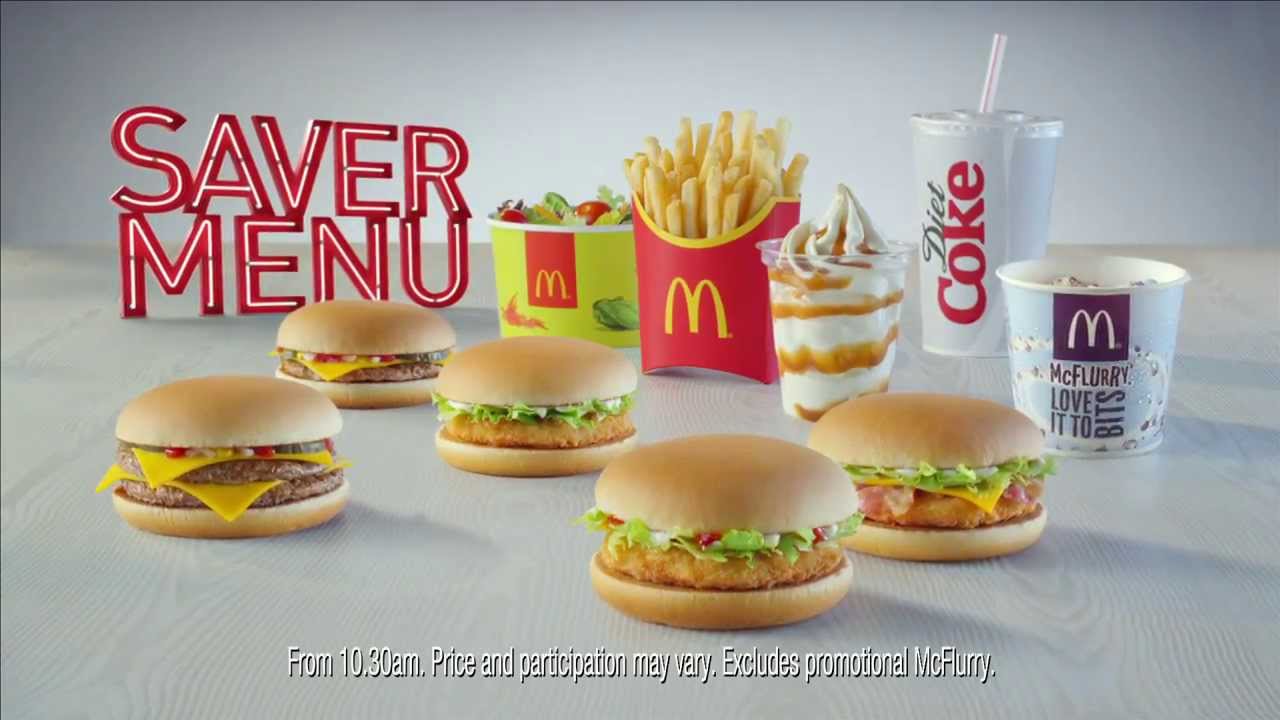
these were the original images I had collected, which also have the source to where I found them. 


I did all of the editing within Photoshop for most of the images, but for some of them I simply printed them off and re- scanned them, but whilst they were being scanned moved them about to achieve a glitch effect.

these were some of the glitches which I had done, straight from the scanner


Most of them came out pretty well and turned out how I wanted, as the whole concept behind creating the glitch images is because of how they would not have the same effect on people and some people would even be offended by some of the images, which would not be intentionally but would just go to show how used to seeing adverts we are. 

I then went on to edit some of them in photoshop.


Layering up the scanned glitches looked better as for some of them it made it harder to read and make out what it was for, this was the effect I was trying to go for.

I also did some glitch effects using the filters on photoshop, which turned out pretty well, it was more a matter of trial and error with these though.


The final images


I was fairly happy with how the glitches came out as I feel that for their purpose they are suitable.

I also put them into context using mock ups of adverts on billboards and in public places.


This was the finished publication, I also included the rationale paragraph as the introduction to my publication.