For the practical element of my Context of practice, I was initially thinking of doing something which was very adbusters related, similar to the images I was looking when proposing my essay question.
These were the type of images which I was thinking of doing something similar to,
Something using inks which would only show up through certain ways, such as 3D glasses or photochromic ink, I felt that this would have been a good way to incorporate the idea of an underlying meaning or hidden meaning of things. I was considering to do something which would go hand in hand with what I was talking about in my essay but due to not having enough time I had to change my idea.
Here are some of the images which I came about when researching for the publication I was going to be making from my essay.
These posters above were something which I thought was very interesting, as the overall concept is simple but is portraying a very strong message, this was what I was aiming to achieve through my practical piece.
These hijacked billboards, by Robert Mongomery, was another project which I thought was a very interesting idea, as I liked the concept of putting a billboard on its head, and reversing its initial purpose.
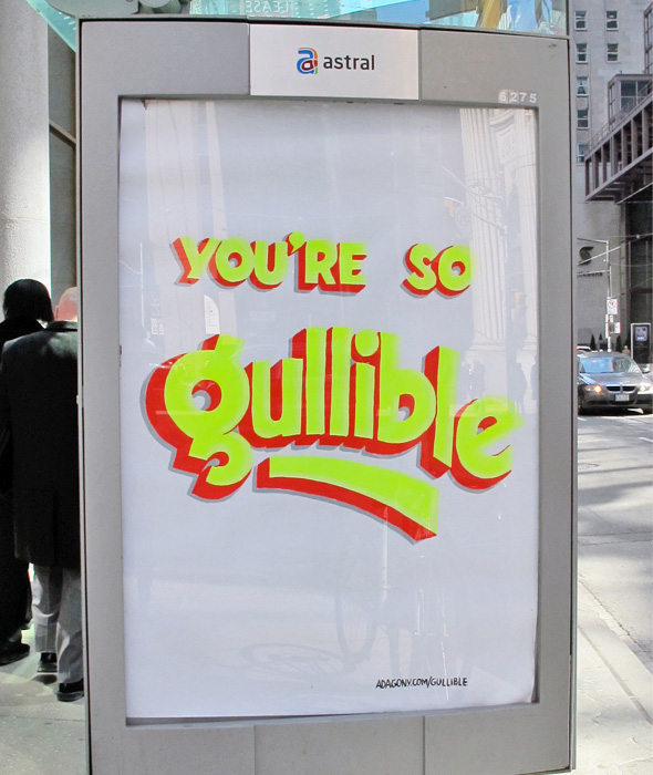
This series of hacked bus stop adverts is another ad busters style project which interested me, as it was similar to my initial idea.
I have collected a few more images on a pinterest board which I will link.
http://www.pinterest.com/RineshMistry/cop-topic/
For this brief the client had already collected some images of existing invitations or general inspiration, this was very helpful as it gave me a good heads up as to what she wanted, and considering how short time I had before she wanted it done, it meant that I was able to get designing as soon as possible.
these were some of the images which she said she really liked
This image was more to do with the colours she wanted on the invite, she specified grey and teal.
Lasercutting was something which came up a lot in the images she had compiled.
She also mentioned that she wanted some sort of henna pattern on it.
She shared the board with me so I was also able to pin things to it, I suggested a wedding logo or monogram as I thought it would be a good way to keep consistency across any of the invitation items.
She really liked the way that this logo had been designed as it was including a pattern as well so it was like both of our ideas in one.
Link:http://www.pinterest.com/frinam/engagement-ideas/
With the brief being a smaller one and due to the nature of it, I asked the client to look at images of examples of branding which is out there at the moment. She had collected a fair amount of image and in addition to this I looked at some of her work to get an idea of what it was that branding was going to represent.
Some of the images which she pointed out to me were
She had said to me that she wanted a CV designing and this was the sort of thing she was after.
She also quite liked this logo and branding for an existing textiles designer.
Link: http://www.pinterest.com/lexxwebb/packaging/