Wednesday, 14 January 2015

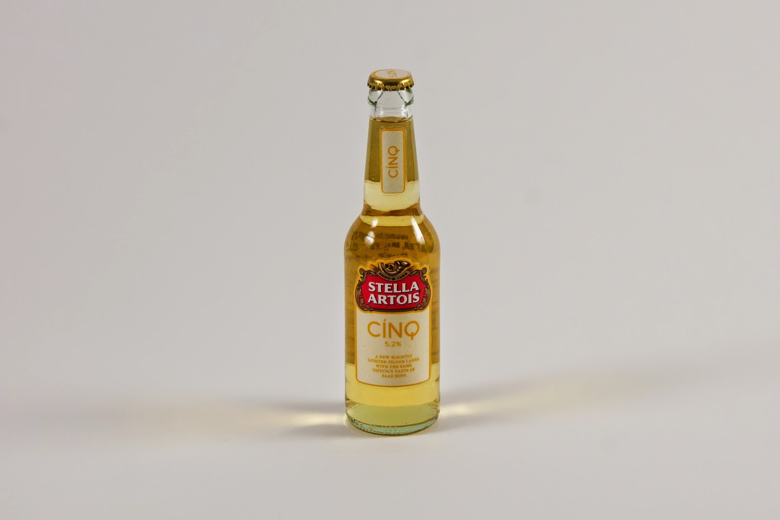
Stella Artois Cinq Final Delieverables photos


Constructing Deliverables

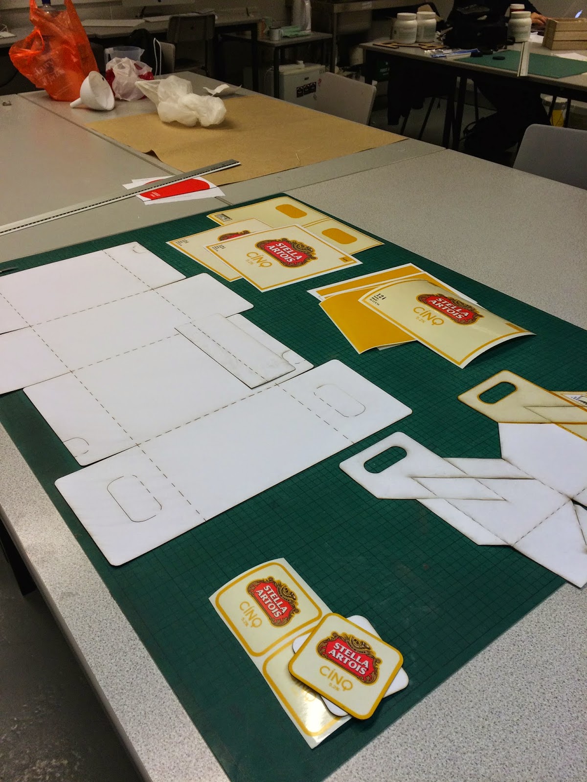
When it came to constructing the deliverables it was not too much of a task as everything was either printed on clear or laminated matte adhesive paper so I simply just had to cut out the design and stick them on. The boxes and the bottle took the longest to stick on.

I had tried to stick a label onto the chalice but decided not to put anything on it in the end, as I thought it would have looked 'over' branded and it did not stick to well either.


To fill the bottles I wanted a lighter looking beer so I used measures of lemonade and apple juice to get to the colour I wanted.


I also purchased a bottle capper to close the bottles as you would find on a bottle beer.


Monday, 12 January 2015

Advert Designs

For the design of the adverts, I had not left myself a great deal of time. I used the photos I had taken of the products and decided to design the adverts around them. 

I wanted to design something which was representative of the drink and also have a comedic value which would draw peoples attention and curiosity. 

I decided to use simple and somewhat cheesy sayings alongside the imagery.


Thursday, 8 January 2015

Final Designs

Now that majority of my deliverables had been delivered in the post I started to finalise the designs which I was going to be applying to them.

these were the designs I chose for the coasters, but in the end only went with the design on the left for both sides.


This was the band which was going to be stuck around the Keg.

 This is the net for the 4 pack carrier, I have only designed the panels which will be on the exterior of the packaging.
This is the design for the 12 pack box but I had designed it as panels as I will sticking it onto the net which will already have been cut out.


These are the labels which I had designed for the bottles.
I was unsure which labels to use, so I stuck on a few to see what they looked like.


I had used matte adhesive paper which I then laminated to give it a slight shine. I also decided to go with the label which was one part and made it bigger as it looked a bit small on the bottle.


Final Logo Choice

After the Crit I finalised the logo which I was going to be using and applying to my deliverables. 


I had chosen to go with a white and yellow pin stripe background, I think this worked better as having it all white would have looked a bit bland and somewhat 
corporate.


Wednesday, 7 January 2015

Lasercut Boxes

Using some white card from the library I tried the templates to see what they looked like.


I also drew on any changes that were needed, such as handles to pick up the box.


I was initially planning to use corrugated card to make the boxes but the sheet which I had ordered was not the right size and could not be sent in such low quantities. I then tried a new box net but also tried different materials I could maybe make the box from.


This was done using mountboard but did not work very well as It was snapping instead of bending.