Wednesday, 14 November 2012

6 Images

These are the 6 images that I have chosen that Like and dislike consisting of Type, Type and Image and just Image.

Type

Like

Dislike

Type and Image

Like

Dislike

Image

Like

Dislike


Saturday, 27 October 2012

OUGD401 Context Of Practice Studio Task 1

Prior to the first studio session we had to bring in 2 images that we liked and 2 that we didn't.

These are the 2 images that I liked


And the 2 images that I disliked


We were split into groups and had to write on the back of each of our images either an 'L' for like or a 'D' for dislike. We then swapped tables with another group and had to arrange their images into likes and dislikes not knowing what they had actually categorized them as.

We then had to talk about how and why we criticized the images .

D - (Describe - what you can see)
I - (Interpret - What it is about)
E - (Evaluate - How effective is it)
T - (Theorize - could it be improved)

We then got into pair and had to use this criteria to critic one image that we liked from our own images and one of our partners.


My Image Right and Partners Left.

My Image :
D
  • Multiple forms of packaging and design
  • good use of colour and layout
  • Clean vector based style to the logos and overall aesthetics
I
  • Branding project for a line of food for a restaurant
  • Retro American diner style
  • Traditional American food
E
  • Clear sense of Branding
  • Fulfilled its purpose
T
  • Use of colour in some places could be changed
  • Some items look as though they are not part of the whole set
Partners Image

D
  • Geometric Shapes with images, textures and clever use of typography
  • Pastel Colour scheme
  • Minamalistic design
I
  • Abstract piece of graphic design
  • sleek clean look to overall image
E
  • Visual quality and overall image has been put together very well
  • could be more suited to initial purpose 
T
  • more imagery that would suggest or link more to music


Thursday, 25 October 2012

Visual Literacy - Two Images I Like and Dislike

Images I dislike:

The first Image I have chosen is promotional graphic for a club. I dislike it because I think that the overall quality of the image is terrible and could have been done so much better, also I think that use of type could be a lot better especially the way they have tried to edgy and use different typefaces, I personally think the whole image just doesn't work.


This second image I had chosen which I dislike is one for promotional offers for a restaurant. I think this is bad design as I think the colours that they have chosen are not complimentary, jarring or compatible in any way.

Images I like:


These two images that I like I have chosen due to the fact that they both fit their purpose which Initially is the purpose of any graphic design image. Along with that I think that they are both visually well done and have been thought out from the use of type through to the colours and media and format.


Message and Delivery: Research

Today we were set a new studio brief called message and delivery, which is still part of The Visual thinking Module/OUGD403. During the studio session we had to get into groups of 4 and think of the biggest news stories from the past 10 months, then syphon them down to three. The ones that we had come up with were:


  1. The Man Jumping from space
  2. Great Britain coming 3rd in the 2012 Olympics
  3. Last year it was the 10 year anniversary for 9/11
After this we then were set a task to choose one story, article or theme from tuesdays paper. With this one story we would have to research about it and things relevant to it.

The story I had chosen was to do with a new drug that might be introduced onto the market which could get rid of scars.
This story was in the Daily Mail,


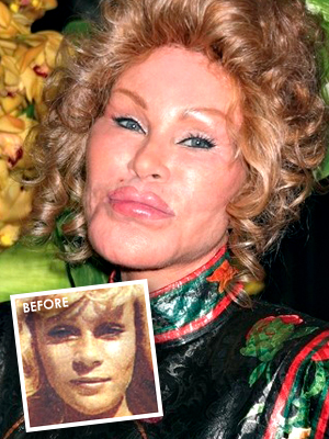
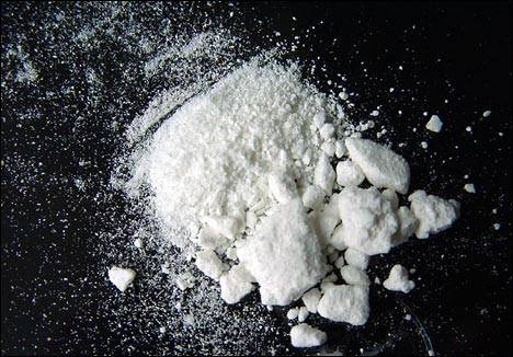
Due to the nature of the topic I decided to go off on more of a tangent or choose something that was related to it rather than the subject matter directly. I had started with looking what people percept as beauty these days what lengths they will go through to maintain it.

Badly Done Plastic Surgery


Medicine and Prescriptions

Botox


Pills


Illegal Drugs


Graphic Design - A Media For the Masses Lecture Notes

Notes from the first lecture solely on graphic design.


Tuesday, 23 October 2012

5 Images of Modernist & Post Modernist Design

Modernist

The modernist era was one known for keeping a strict uniform style of simplicity, function over form and clean, efficient looking Graphic design. I think that these 5 images fit into the category of Modernist design.

This first image is modernist because of the use of simple colours and geometric shapes and how it is so clean and minimalistic. Allner, W 1953 'Fortune Cover'


This second image in one done in the style of modernism which was for a modernism exhibition at the V&A Gallery in London during 2006.


The next image is one that is used by the National Park Service and is a series of icons and pictographs which I believe interpret modernism through how simple they are and also the choice of colours.


This next image is from the cover of the book Swiss Graphic Design and I think is modernist due to many factors such as the font, colours, layout and is just overall a modernist piece of Graphic Design.


The next image is the Iconic London underground map, which is the first edition. This image is modernist due  to its simplicity and the idea of function over form.


Post Modernism

These next 5 images I believe fit into the category of Post Modernism, which was the era straight after modernism which was all about bending the rules and at times using the idea that there was no rules, this meant that there was no distinctive 'post modernist uniform style'.

This first image is one that I don't particularly like due to how the colours clash and how it can be seen to be tacky, it was a cover for the ID magazine.


The next image is again a magazine cover for WET, which I think is postmodernist due to dexterity of colours used and the way that shapes have been used.


This next image is a cover for eye magazine which I believe works as post Modernism due to shapes being so non geometric and the style of image being so loose.


The next image is a iconic image from the Post modernist era. The Cambells Soup by Andy Warhol.


The last image I have chosen to be post-modernism is the God save the queen by Sex Pistols. This was also another iconic style of post modernist graphic design.


Thursday, 18 October 2012

Study Task 3 - 500 Word Comparison


Following on from the LCA Prospectus task during our seminar with Richard we started to look at 2 images, these 2 images were ‘The Uncle Sam Range’ and the second was a poster my Saville Lumley – 1915.
During the session we had discussed about each image and what it was that we interpreted from it and about it. 

Some of the things we picked up on were:
·       Patriotism
·         Aimed at males
·         Aspirational Lifestyles
·         Current trends
·         Family orientated

Critical Analysis

The first image named ‘The Uncle Sam Range’ dated 1876 was done by Schmacher and Ettinger. From simply looking at the image the one theme that you can easily pick up on is that it is somehow related and linked into patriotism as the American flag is practically plastered all over the image and also the main figure ‘Uncle Sam’ is directly linked in with Patriotism and war. Only after having analysing it would you come to know that it is in fact an advert for the oven, this is due to the overall style of the image and how people are used to the item being advertised as the main focal point of the image; Whereas in this image the centre of attention seems to be drawn to the people and the large earth like man. It seems to be the lifestyle or ‘image’ of having one of these ovens that they are trying to sell, as by the look of people in it they seem to fairly well off so it looks to be something that would be aimed at people of the same class. One of the other things that we picked up on was that there was a slave in the image which show when the image was made and what the current time period was.
Looking at the second image the Saville Lumley Poster, once again the theme of patriotism is running though it but from a slightly more subtle tone this time but a relatively similar subject matter. The use of text in this image is more edging towards a more graphic design orientated style rather than fine art. This image has some fairly strong messages. One of the main things that we picked up on as the meaning or message from the image was that it was aimed at Men who had not gone to war and what it would be like after we had one it. As the text emphasises the ‘YOU’ to show this. There are also small details such as the boy on the floor who’s is playing with soldiers and gun  toys.
Looking at them both side by side one of the main themes running through the both of them was the idea of aspirational lifestyles and how they are portrayed. This is due to the fact that in both of them there is something that men would look forward or aim towards doing/possessing. In this case having fought for his country and being able to provide for your family with a brand new oven. Another thing that was pointed out about both the images was the audience they were aimed at as by the looks of the people, how they are dressed and their surroundings would indicate that it was aimed at the middle and upper class especially emphasised by the imclusion of a black slave in the ‘Uncle Sam’ Poster. In conclusion both of these images are aimed at the same audience and have similar messages and themes but have approached it differently.